
Every year, thousands of patients are harmed because two drug names look or sound too similar. Tall-man lettering is one of the simplest, cheapest, and most widely used tools to stop this from happening. It doesn’t require new machines, expensive software, or extra staff. All it needs is a few capital letters.
What Is Tall-Man Lettering?
Tall-man lettering is a way of writing drug names so the parts that make them different stand out visually. Instead of writing "prednisone" and "prednisolone" in all lowercase, you write them as predniSONE and predniSOLONE. The capitalized letters-"SONE" and "SOLONE"-jump out at the eye, making it harder to pick the wrong one.
This isn’t just a design choice. It’s a safety rule backed by decades of research. The Institute for Safe Medication Practices (ISMP) started pushing this method in 1999 after noticing how often nurses and pharmacists grabbed the wrong drug from a list. In 2001, the U.S. Food and Drug Administration (FDA) launched its own program to standardize these changes. Today, nearly all hospitals in the U.S., Australia, and New Zealand use some form of tall-man lettering.
The idea is simple: when two drugs are nearly identical in spelling, highlight the key difference with uppercase letters. For example:
- vinBLAStine vs. vinCRIStine
- CISplatin vs. CARBOplatin
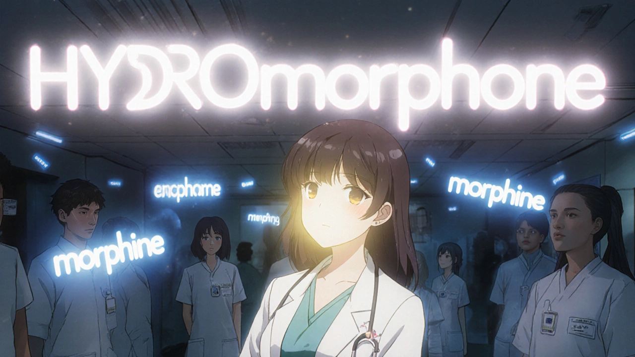
- HYDROmorphone vs. morphINE
- ALPRAZolam vs. LORazepam
These aren’t random. Each capitalization follows a strict pattern based on where the names diverge. The goal is to make the difference obvious-even if you’re tired, rushed, or reading a small screen.
Why Does It Work?
Our brains are wired to recognize patterns quickly. When you see a word like "prednisone," your brain doesn’t read every letter. It scans for familiar shapes. That’s why two similar names can trick even experienced staff.
A 2004 eye-tracking study by ISMP showed that when drug names were written in tall-man lettering, healthcare workers made 35% fewer selection errors in simulated settings. That’s not a small number. In a busy hospital pharmacy, that could mean avoiding dozens of mistakes every week.
It’s not magic. It’s visual contrast. Capital letters create a break in the flow. Your eyes stop at the uppercase part. You don’t just see "-sone"-you see "-SONE." That pause gives your brain a second to check: "Is this the right one?"
It works best in high-pressure environments: emergency rooms, ICU units, and fast-moving pharmacies. That’s where mistakes happen fastest-and where even a tiny visual cue can save a life.
How It’s Used in Real Systems
Tall-man lettering isn’t just printed on labels. It’s built into the systems you use every day:
- Electronic Health Records (EHRs) like Epic and Cerner
- Automated dispensing cabinets (Pyxis, Omnicell)
- Prescription labels from pharmacies
- Medication administration records (MARs)
- Drug databases and clinical decision support tools
In Australia, the National Mixed-Case Lettering List includes 192 drug pairs that must be formatted this way. In the U.S., the FDA’s list has 72 pairs, and ISMP tracks over 250. These lists are updated regularly based on new error reports.
One hospital in Sydney implemented tall-man lettering across 13 systems, changing 210 drug names. They didn’t just update labels-they reprogrammed their entire EHR, pharmacy software, and automated dispensing machines. It took 16 weeks. But within six months, they saw a 42% drop in overridden alerts for look-alike drugs.
That’s the power of consistency. If one system writes "FLUoxetine" and another writes "fluoxetine," you’re back to square one. The whole point is that the capitalization is the same everywhere.

The Problems With Tall-Man Lettering
It’s not perfect. And it’s not a cure-all.
First, there’s inconsistency. The FDA recommends one capitalization pattern. ISMP recommends another. In some places, you’ll see HYDROcodone and oxyCODONE. In others, it’s hydroCODONE and oxycodone. That confuses staff who move between hospitals or pharmacies.
Second, it doesn’t help with all drug pairs. If the difference is at the start-like "metoprolol" and "methyldopa"-capitalizing the end letters won’t help. Your eye still glides over the first syllable. That’s why some experts say tall-man lettering only works for certain types of confusion.
Third, font size matters. If the screen or label is too small, the capital letters don’t stand out. A 2022 Reddit post from a doctor said: "I keep mixing up ALPRAZolam and LORazepam because our EHR uses tiny font. The capitals are just dots."
And fourth, some people think it’s enough. They stop double-checking. They rely on the letters instead of verifying the patient, dose, and route. That’s dangerous. Tall-man lettering is a backup, not a replacement for human caution.
What Experts Really Think
Most professionals agree: tall-man lettering is worth doing-but only as part of a bigger safety system.
Dr. Michael Cohen, who led ISMP for years, said: "It’s not a panacea, but it’s one essential layer." That’s the key phrase: one layer.
He and others stress that it should be used with:
- Barcode scanning at the bedside
- Independent double-checks for high-risk drugs
- Clear verbal communication (saying the full drug name out loud)
- Standardized order sets in EHRs
A 2022 Cochrane review found moderate evidence that tall-man lettering reduces selection errors-but low evidence that it reduces actual patient harm. That means it helps you pick the right drug from the list, but if you still give the wrong dose or to the wrong patient, it won’t stop you.
Some critics, like Dr. Robert Wachter, argue that better electronic prescribing systems with forced choices (like making you select a reason if you override a warning) are more effective. And they’re right. But those systems cost millions. Tall-man lettering costs a few thousand dollars to implement.
For most hospitals, especially smaller ones, it’s the most practical first step.
How to Implement It Right
If your workplace doesn’t use tall-man lettering-or uses it inconsistently-here’s how to fix it:
- Start with your local list. Check your country’s official guidelines. In Australia, use the National Mixed-Case Lettering List. In the U.S., use ISMP’s list. Don’t guess.
- Map it across all systems. Find every place drug names appear: EHR, pharmacy software, labels, automated cabinets, training materials. Make sure they all match.
- Work with IT. You can’t just change a label. You need to update databases, fonts, and display rules. This takes time and tech support.
- Train everyone. Nurses, pharmacists, doctors, and even clerks need to know why it’s done this way. Show them examples. Let them practice spotting the differences.
- Monitor and adjust. Track how often errors drop. Ask staff: "Do you notice a difference?" If they say no, fix the font size or capitalization.
Don’t rush it. A 2022 study found that hospitals that took at least 16 weeks to implement tall-man lettering had better results than those that did it in a week.
The Future of Tall-Man Lettering
In 2023, the FDA and ISMP announced they’re working together to create one unified list. That’s huge. Right now, confusion between guidelines is one of the biggest problems.
Some hospitals are testing AI that adjusts tall-man lettering in real time based on error trends. For example, if staff keep picking "FENTanyl" instead of "FENTanyl patch," the system might highlight "FENT" even more.
But here’s the truth: no matter how smart the tech gets, people will still need to read names. Voice recognition and barcode scanning help-but they don’t replace visual checks. As long as humans are reading screens and labels, tall-man lettering will stay relevant.
The Institute for Safe Medication Practices says it best: "Tall-man lettering will continue to serve as a critical visual safeguard even in highly automated systems."
It’s not flashy. It doesn’t make headlines. But it saves lives every day.
What You Can Do Today
If you’re a nurse, pharmacist, or doctor:
- Check your EHR. Are high-risk drug names in tall-man lettering?
- Look at your pharmacy’s printed labels. Do they match?
- When you see a drug name, pause. Do the capitalized letters make the difference clear?
- If not, speak up. Ask your pharmacy or IT team to review the list.
If you’re in management:
- Review your systems. Are they using the latest official list?
- Is the capitalization consistent across all platforms?
- Are staff trained on why it matters-not just how to use it?
It’s a small change. But in healthcare, small changes save big lives.
What is tall-man lettering?
Tall-man lettering is a typographic method that uses selective capitalization in drug names to highlight differences between look-alike, sound-alike (LASA) medications. For example, writing "predniSONE" and "predniSOLONE" makes it easier to tell them apart visually and reduces the risk of medication errors.
Which organizations recommend tall-man lettering?
The U.S. Food and Drug Administration (FDA), the Institute for Safe Medication Practices (ISMP), and Australia’s National Commission on Safety and Quality in Health Care all recommend tall-man lettering. Each maintains its own list of drug pairs that should be formatted this way, with efforts underway to harmonize them.
Does tall-man lettering actually reduce errors?
Yes, studies show it reduces selection errors by up to 35% in simulated environments. Real-world data from hospitals show drops of 40% or more in alert overrides for look-alike drugs after implementation. However, it’s most effective when used alongside other safety practices like barcode scanning and double-checks.
Why don’t all hospitals use it consistently?
Inconsistencies come from different guidelines (FDA vs. ISMP), outdated software, poor font choices, and lack of coordination between systems. Some EHR vendors don’t update their databases regularly, and community pharmacies may follow different rules than hospitals. This creates confusion, especially when staff move between settings.
Is tall-man lettering enough to prevent all medication errors?
No. It’s one layer in a defense-in-depth strategy. It helps reduce selection errors, but doesn’t prevent wrong dose, wrong route, or wrong patient errors. It must be paired with barcode scanning, independent verification, clear communication, and standardized order sets to be truly effective.
How can I check if my facility uses tall-man lettering correctly?
Compare how high-risk drug names appear in your EHR, pharmacy labels, and automated dispensing cabinets. Use your country’s official list (e.g., Australia’s National Mixed-Case Lettering List or ISMP’s list in the U.S.). If the capitalization varies between systems or doesn’t match the official standard, raise it with your pharmacy or IT department.


gina rodriguez
Tall-man lettering seems so simple, but it’s crazy how much it helps. I work in a busy ER and I’ve seen nurses grab the wrong drug before-once it was hydromorphone and morphine. After we switched to HYDROmorphone and morphINE, I noticed people paused longer before clicking. Small thing, big difference.
Sue Barnes
Why are we still talking about this like it’s a breakthrough? It’s 2025. We’ve got AI alerts, barcode scans, voice recognition-yet we’re still relying on capital letters like it’s 1999? If your system needs this to avoid errors, you’ve got bigger problems.
Sachin Agnihotri
Hey, I work in a small clinic in Mumbai, and we started using tall-man lettering last year-no budget, just a shared Google Doc with the ISMP list. We changed 12 drug names in our EHR. Staff were skeptical at first, but now they say they catch mistakes before they happen. Not magic, but it works. And it’s free.
Also, font size matters. We switched from Arial to Verdana and suddenly, the capitals popped. No extra cost. Just better choices.
And yes, consistency is everything. One nurse used to write "alprazolam" in her notes, and another wrote "ALPRAZolam"-we had to train everyone to match the system. Took a month. Worth it.
Also, don’t forget: it’s not just about the letters. It’s about training people to actually look. We started doing a 2-minute daily huddle where someone points out one pair. It’s weird, but it sticks.
And no, it doesn’t fix everything. But if you’re not doing this, you’re leaving a door open. And in healthcare? That’s not okay.
Jacob Keil
So we’re gonna capitalize letters to fix human error? Wow. Next they’ll tell us to wear socks to avoid slipping. I mean, come on. If your brain can’t tell the difference between prednisone and prednisolone after 10 years in the field, maybe you shouldn’t be handling meds. This is band-aid medicine. Literally.
Also, I just typed "morphine" and it auto-corrected to "morphine"-wait, no it didn’t. That’s the problem. Tech doesn’t help if we don’t fix the root cause: lazy training.
Andrea Jones
Wow, so we’re back to the 90s? Capital letters are our savior? I mean, really? Next they’ll make us clap twice to confirm a prescription. At least we’re not using Morse code yet.
But honestly? I’m weirdly impressed. It’s the kind of dumb-simple thing that actually works. Like wearing a seatbelt. No one thinks it’s cool, but you’re dumb if you don’t do it.
Also, the font size thing? YES. I’ve seen ALPRAZolam look like "alprazolam" on a tiny iPad screen. The capitals are just smudges. Fix the screen first, then the caps.
Justina Maynard
It’s fascinating how such a tiny typographic tweak can alter cognitive processing. The visual salience of uppercase segments creates a perceptual break that interrupts automaticity-a phenomenon well-documented in Gestalt psychology. The brain’s pattern recognition system is hijacked by the anomaly of capitalization, forcing a moment of deliberate processing. This is not merely a formatting choice; it’s a cognitive nudge. And yet, the institutional resistance to standardization across systems remains baffling. Why do we tolerate fragmentation in safety-critical domains? It’s not laziness-it’s systemic inertia. And inertia kills.
Evelyn Salazar Garcia
USA does this. Other countries? Not so much. We’re better. End of story.
Phil Thornton
I used to work in a pharmacy where they didn’t use tall-man lettering. One day, someone gave a patient 50mg of prednisone instead of 5mg. Patient ended up in the ICU. We didn’t find out until the next morning. That’s not a mistake. That’s a tragedy. Now? We use it. No debate.
Sean Slevin
Capitalization… it’s not just about letters, is it? It’s about attention. It’s about the pause. The breath between seeing and acting. In a world of speed, we’ve forgotten that slowness saves lives. The uppercase isn’t a fix-it’s a reminder. A whisper: "Wait. Look again. Are you sure?" And in healthcare, that whisper is louder than any alarm.
But here’s the deeper truth: we don’t need more tools. We need more presence. Tall-man lettering is just the first step toward reclaiming mindfulness in a broken system.
Still… I wish the FDA and ISMP would just agree on one list. Why is this so hard? Are we afraid of harmony?
Chris Taylor
My mom’s a nurse. She told me about this last year. Said she used to mix up alprazolam and lorazepam all the time. Now she just looks for the caps. Said it’s like seeing a red flag in a sea of gray. She didn’t even realize how much it helped until it was gone.
Melissa Michaels
Implementation of tall-man lettering requires strict adherence to standardized guidelines. Consistency across all digital and print platforms is non-negotiable. Failure to align with ISMP or FDA standards introduces new risks through inconsistency. Training must be mandatory and documented. Audit trails should be maintained to ensure compliance.
Nathan Brown
There’s something poetic about this. We’re using the most basic thing-capital letters-to fight the chaos of modern medicine. It’s like writing a love letter with crayons when everyone else is using lasers. But somehow… it works. Maybe it’s not about tech. Maybe it’s about humility. We’re not infallible. So we make the letters stand out so our brains can catch up. I respect that.
Also, I’ve seen this in India too. A rural hospital in Kerala started using it last year. They didn’t have EHRs. They printed the names on sticky notes and stuck them on the shelves. And guess what? No more mix-ups. Simple. Human. Effective.
Matthew Stanford
Let’s not forget who this is for. The patient. The person lying there, trusting us. They don’t care if we use ISMP or FDA lists. They just want the right pill. So if a little capitalization saves someone from a bad reaction, we do it. No ego. No politics. Just care.
Also, if your EHR vendor won’t update their list, fire them. Seriously. This isn’t optional.